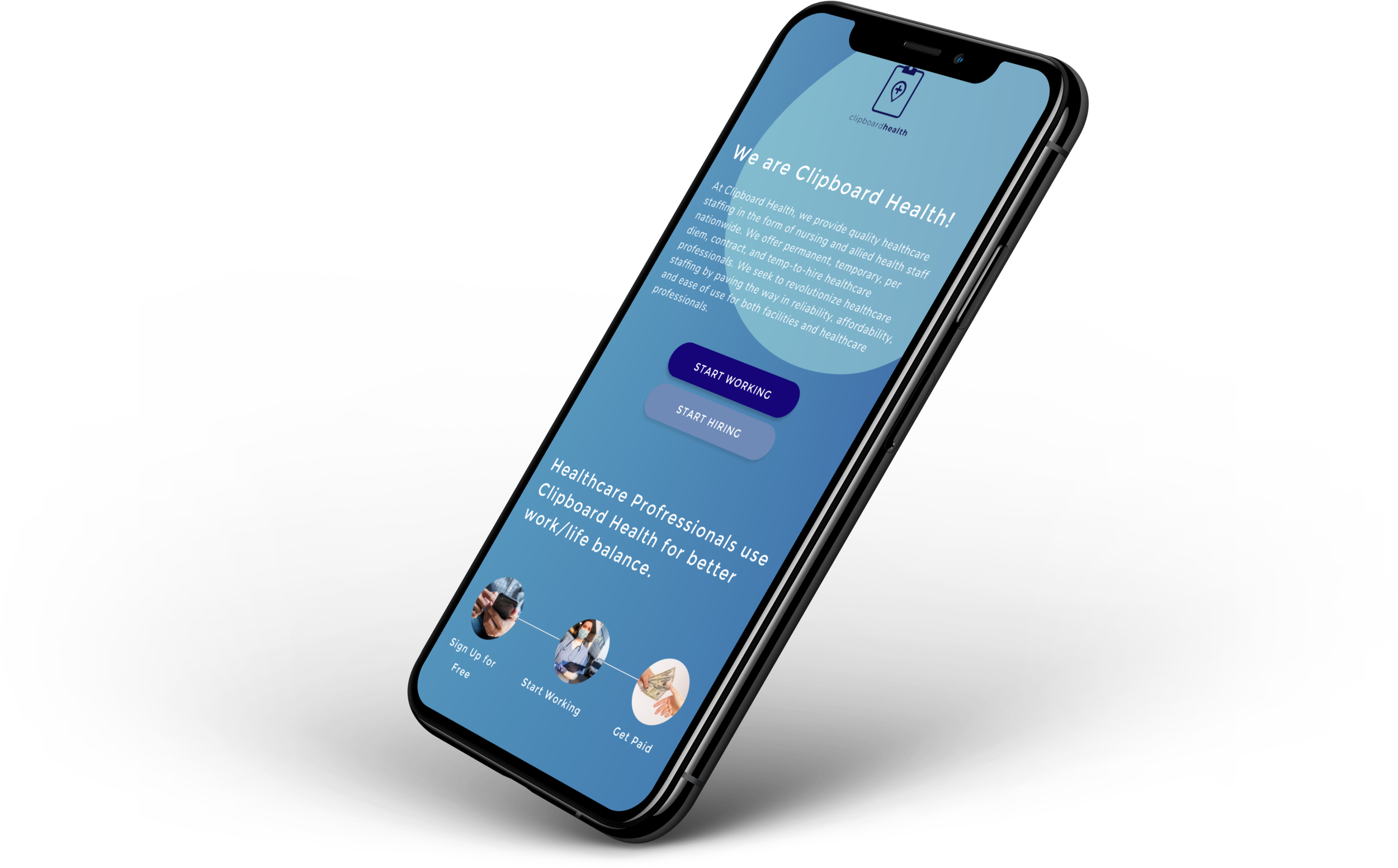
What Clipboard Health can offer to healthcare professionals
Research and feature design project for Clipboard Health
TL;DR
Challenge
Help prospective users who cannot see per diem shifts available to them by Clipboard Health
Solution
Create a feature in which prospective users can browse Clipboard Health’s offerings, without fully onboarding
My role
UX Researcher
What I did
Market research
User surveys
User interviews
Competitive/comparative analysis
Affinity mapping
Wireframing
Prototyping
Usability testing
Tools
Airtable
Figma
Miro
Whimsical
Zendesk
About Clipboard Health
Clipboard Health is a marketplace platform based in San Francisco, CA that posts per diem shifts to nurses and healthcare professionals.
According to their website: “We give facilities peace of mind knowing that their shifts will be filled by reliable staff, while professionals get the flexibility and freedom to live their lives to the fullest.”
Challenge
My team was approached by Clipboard Health to conduct user research and help them attract new prospective members.
The main problem currently is only fully-onboarded healthcare professionals can view which specific shifts are available to them, curbing the incentive for prospective users to apply.
Solution
We prioritized designing an informative, easy-to-use experience for prospective Clipboard Health employees to find available shifts in their area, before they commit to applying to the company.
Objectives
1. Design a feature that allows prospective users to see the available shifts in their area, not just onboarded users.
2. Build filters for easier browsing, the ability to favorite shifts, and display a medical facility’s ratings and reviews.
Methods
Market research
I researched the landscape of the healthcare job market and discovered:
Healthcare workers are experiencing similar rates of job instability as the general public.
Not only could Clipboard Health mitigate the 80% abandonment rate of their onboarding process, but also help the average Clipboard Health user - on average, of a marginalized identity - find employment.
User survey
We sent a user survey asking healthcare workers about their job hunting experiences.
96.5% of applicants expect to see job descriptions when job searching (duh)
Salary is the strongest consideration for prospective employees
Currently, Clipboard Health only lists:
Wide salary ranges
No hourly rates
Vague job descriptions
Competitive analysis
Using a feature inventory, we compared Clipboard Health’s current shift browsing experience to competing staffing agencies:
NurseGrid
NurseFly
BlueCrew
The features we focused on were:
Visibility of available shifts
Advanced filtering
Feedback & reviews
Shift favoriting
Clipboard Health’s current experience lacked all four of the mentioned features.
These four became a priority to incorporate into our design.
User interviews
We then conducted user interviews with existing Clipboard Health employees, asking about the successes and frustrations with their current experience with the platform.
All participants reported zero complaints with the onboarding process, affirming our decision to focus on the prospective user experience.
Comparative analysis
We conducted usability tests of two comparator apps known for their excellent browsing experience: AirBNB and ZocDoc.
We recruited 5 healthcare professionals to execute simple tasks on the apps, and asked for their feedback.
Their enjoyment of the comparators’ experiences boiled down to:
Efficiency
Customization
Visual appeal
Thus, we focused on those three attributes during our initial sketches.
Affinity mapping ➡️ Persona creation
Meet the Busy Bunny! Our design muse, our north star, our end user.
Now that we had a reference point for our design decisions, it was time to get to work on a prototype!
Protoype and usability testing part deux
Now with a working prototype of Clipboard Health’s shift shopping experience,
we contacted the same usability test subjects and asked them to directly compare our design with those of AirBNB and ZocDoc.
Overall, they agreed that we had accomplished an intuitive, straightforward showcase of Clipboard Health’s available shifts.
We did receive some constructive feedback:
Users wanted more information about the company before committing to looking for shifts.
The iconography we chose to indicate time of shift was confusing.
To address these issues, we included more information on our homepage about the benefits of working for Clipboard Health. We also placed the icons under the filter to select time of shift, to explain their meaning.
Deliverables
Shopping made simple
Inspired by the best practices of other shopping experiences, our prototype gives the user the opportunity to browse through shifts in their area with the ease of shopping for a weekend hotel.
An experience made for me
With options to filter and sort available shifts, our users quickly see how Clipboard Health can fit within their active lifestyles.
These are a few of my favorite shifts
Collecting all favorited shifts on one page will help our users make a fast, informed decision to join Clipboard Health.


