
Invite the data-curious to ThoughtSpot
UX writing & content design for ThoughtSpot’s free trial product tutorial
TL;DR
Challenge
Counteract low rates of free trial users and low rate of conversions to account holders
Solution
Provide content that helps guide prospective users through the conversion tunnel
My role
UX Writer
What I did
Content strategy
Desktop and mobile UI copywriting
Information architecture
Marketing copywriting
Tutorial design
UX writing
Tools
Miro
Figma
Jira
About ThoughtSpot
ThoughtSpot is an AI-powered analytics software company based in Sunnyvale, CA. Their mission is to “create a more fact-driven world with the easiest-to-use analytics platform.”
I served as a UX Writer on their content team, working to distill complex data vocabulary and principles into clear, informative copy that could successfully guide data dummies (I say that being one myself) through the software. Have you ever tried to explain a Chasm Trap to a non-data scientist?
Challenge
ThoughtSpot noticed a low sign-up rate for free trials, and a low conversion rate of potential users who sign up for a free trial to becoming account holders. I was selected to work on the copy and overall strategy for the content potential users encountered during the conversion funnel.
Solution
Provide a guided experience for free-trial users to use product features and even upload their own data, without any real commitment.
Objectives
1. Provide simple modules that walk free trial users through the most fundamental features.
2. Encourage users to take action, whether navigation or exploration.
3. Highlight the benefit of the actions they take.
4. Give users a guided opportunity to upload and play around with their own data.
5. Ensure consistent voice & tone for content throughout the conversion funnel, including the email invitation, the product tutorial itself, and the opportunity to play with your own data.
Before

After

It starts with the first touchpoint, The Cloud trial invitation email. I prioritized concision, aligned language between the subheadline and CTA button, and removed directional language for accessibility purposes.
Methods
ThoughtSpot’s voice is like that of an AI assistant: helpful, courteous, but not overly-personal. I consistently checked my work against those voice guidelines to ensure that the Cloud trial process was encouraging without gushing.
Ensure consistency with ThoughtSpot’s voice & tone
With a product as robust as ThoughtSpot, it can be challenging to distill functionality into a sentence or two. I captured the core of the feature’s functionality in as few words as possible to not overwhelm the user.
It was important that I check my definitions and explanations with engineers and product managers, to ensure that the content I provided was easy-to-understand and accurate.
Explain key features with sparing detail

Collaborate with product experts
Deliverables

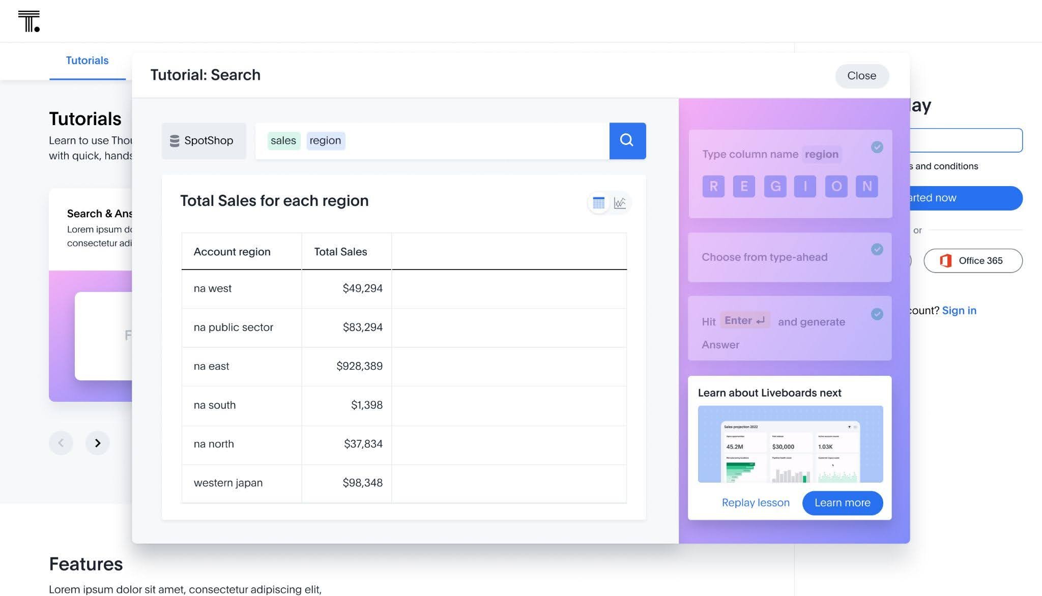
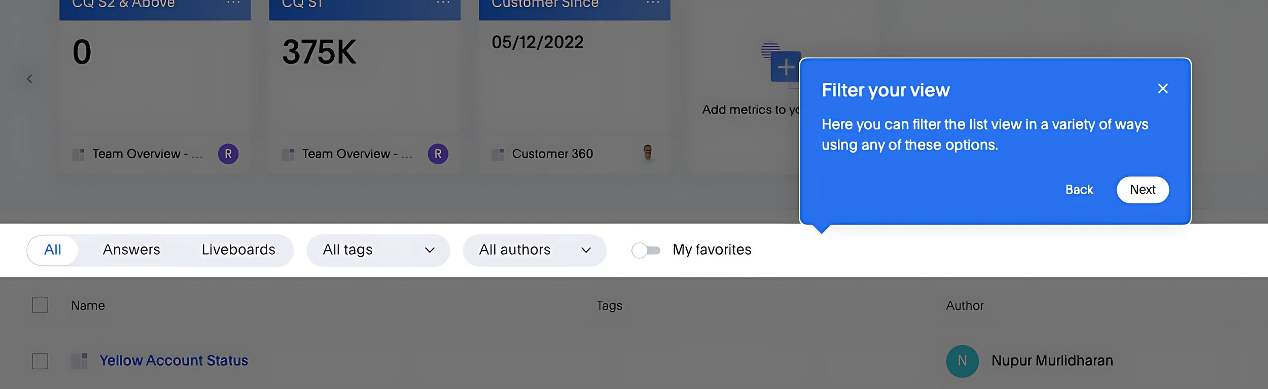
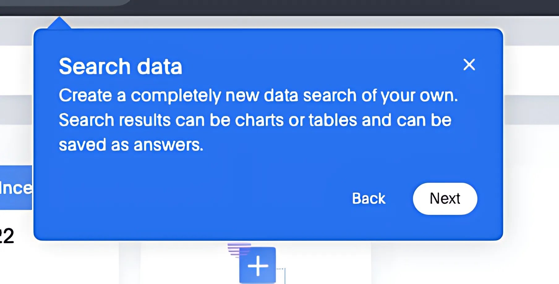
Simple tutorials that encourage action
Modules that walk free trial users through real actions that they can take within the product, with the simplicity that ThoughtSpot touts.
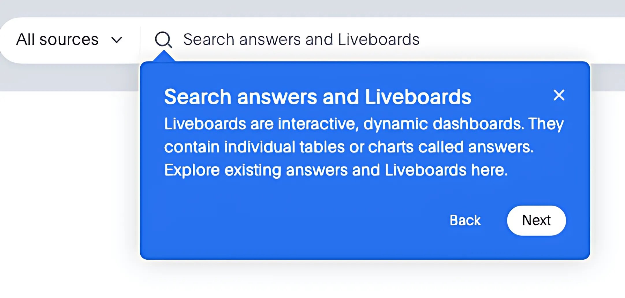
Explanations of the more proprietary features
Liveboards? I don’t know her. But it’s okay, we have the answer.

Encouragement through this new territory
A simple “Nice job” can go a long way, especially when you are navigating an unfamiliar product.
*and yes, the ‘button above’ directive is not compliant with accessibility best practices. I continue to learn and grow!

Real-life applications and quelling anxiety
Allowing potential users to try ThoughtSpot with their real data helps the user see what the product can specifically do for them.
If users were to (understandably) hesitate uploading their own precious, potentially proprietary data, I assure them: ‘Don’t worry, we keep your data safe.’
Results
22%
Increase in Cloud trial sign-ups since rolling out the tutorial
8%
Increase in conversion of Cloud trials users into account holders